The debate about the need for baseload coal-fired power stations has reignited this week. Energy Minister Josh Frydenberg was quoted as saying he “would welcome a new coal-fired power station for our country because it supplies reliable baseload power and it has served us well in the past and will continue to serve us well in the future”.
There is no doubt that coal has played a significant role in the National Electricity Market (NEM). But can it provide any value in a future highly renewable grid?
Baseload power is a business model, not a technical requirement
Baseload generators such as coal-fired power stations (or nuclear in other markets) have very high fixed costs, but low marginal costs, and are relatively slow at starting up and ramping up and down. In contrast, natural gas generators have low fixed costs, but high marginal costs and are much quicker to start and ramp.
It is from these characteristics that the concept of baseload and peaking generation emerges. The most economic mode of operation for a coal-fired power station is to run at a steady, constant level more or less 24/7. In contrast, the economic characteristics of gas mean that it is better suited to meet the more variable and dynamic portion of electricity demand.
No role for baseload coal in South Australia
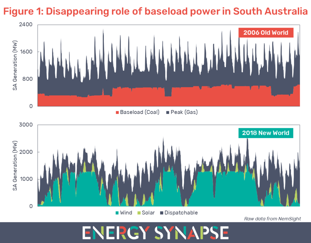
Figure 1 shows electricity generation in South Australia for the previous month (23 May to 22 June 2018) compared with the same period in 2006. We compiled this data using NemSight, a software developed by Creative Analytics (part of the Energy One group).
Back in 2006, there was virtually no renewable energy in South Australia aside from a tiny amount of rooftop solar (<2 MW). The generation mix consisted of brown coal and natural gas. As can be seen from Figure 1, these generators followed the old world paradigm of baseload and peaking generation.
This is in stark contrast to the new world in 2018. For the 31 day period in question, just over 50% of the energy generated in South Australia came from variable renewable energy (wind power, rooftop solar, and large scale solar). The remaining generation came from dispatchable sources, consisting primarily of gas along with a smaller amount of battery storage and diesel generation. There has been no coal in South Australia since the closure of Northern Power Station in May 2016.
As can be seen from Figure 1, in a highly renewable grid, there is no steady profile left for baseload power to service. A power station that runs at a constant level provides no value or enhancement to reliability in this type of system. What is needed is highly flexible and fast responding power. This can come from a variety of sources such as gas, hydro, energy storage, and demand response. However, coal is not one of them.
Renewable energy not to blame for high electricity prices in South Australia
Some people reading this may look at Figure 1 and immediately conclude that the replacement of coal with renewables has lead to high power prices in South Australia. However, South Australia has always had high prices relative to the rest of the NEM. Data from AEMO shows that in 16 out of the last 20 financial years, South Australia either had the highest or second highest wholesale electricity price. This comes about from South Australia having a peaky demand profile, being over reliant on gas, and a lack of competition in the market, among other factors.
Electricity demand must be in balance with supply at every point in time. This is a true technical requirement. However, there are a number of ways to meet this requirement. The economic characteristics of coal and gas led to the baseload/peaker paradigm. In the new world, flexibility is king and this means that the economics of coal are just not going to stack up.
Author: Marija Petkovic, Founder & Managing Director of Energy Synapse
Follow Marija on LinkedIn | Twitter
Five minute settlement rule change: What to expect in the energy market
May 30, 2018
Share
From 1 July 2021, the National Electricity Market (NEM) in Australia will be settled every five minutes. At present, generators in the NEM are dispatched on a five minute basis. However, these five minute dispatch prices are then averaged (on a time weighted not volume weighted basis) to produce the 30 minute Trading Price, which is then used for settlement. When the NEM commenced in the 1990s, the limitations in metering and data processing at the time led to these different periods for dispatch and settlement.
In May 2016, Sun Metals Corporation, which owns a zinc refinery in Northern Queensland, first initiated the rule change request to move to five minute settlement. Their reasoning was that the mismatch in dispatch and settlement:
Allows generators to game the market, thereby increasing prices for consumers; and
Impedes entry for fast response generation and demand side response.
In this article, we will take a deeper look at these claims.
Electricity prices may not reduce as much as people had hoped
Aligning dispatch and settlement is logical and will make for a more transparent market, but the big question for many in the industry is how will the change affect wholesale electricity prices? Many are hoping that the five minute settlement rule change will be a magic bullet to reduce energy prices. As usual, reality is considerably more complex and nuanced.
This RenewEconomy article illustrates how generators are able to game the market under the current rules. It gives the example of a 30 minute trading interval that contains a price spike of $13,800/MWh in only one of the five minute dispatch intervals. This means that the price averages out to $2,350/MWh over 30 minutes. The important thing to note is that the generator in the example had very low output during the price spike, and only increased output after the fact. The averaging effect means that the generator is able to receive $149,000 for this 30 minute period under the current 30 minute settlement. However, under five minute settlement, the generator would receive only $15,000.
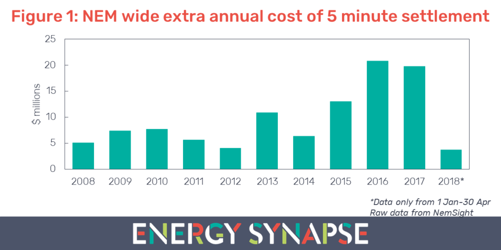
So just how much does this averaging effect distort the market as a whole? As it turns out, not much. We used NemSight, a software developed by Creative Analytics (part of the Energy One group) to examine the difference in settlement values across the entire NEM from 2008 to April 2018. We found that the cost to consumers under a five minute settlement would have been over $100 million higher than compared with 30 minute settlement. In fact, every single year produced a cost rather than a benefit as seen in Figure 1. Even on a state level, every state had a cost in every year.
Although $100 million may seem like a large sum, it is only 0.09% of the total value transacted in the NEM. We consider this to be a negligible impact. However, the real life difference could be much greater. We anticipate that the bidding behaviour will change significantly under five minute settlement. In particular, we expect that most existing generation in the NEM will struggle to respond to five minute price spikes, especially when they are unexpected. This means that it will be largely up to fast responding technology, such as batteries, to regulate prices. Therefore, for consumers to benefit from the change, there will need to be enough fast responding technology entering the market to offset the reduced response from the incumbents.
Furthermore, when it comes to pricing outcomes, there is a much bigger elephant in the room – the high concentration of market power in the NEM. Regardless of whether settlement is calculated on a five or 30 minute basis, certain generators still have sufficient market power to raise prices by restricting output and will be significantly better off by doing so.
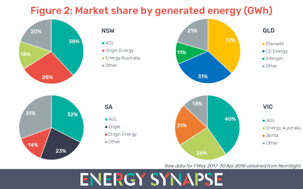
In Figure 2, we examined the market share of participants in the NEM by generated energy (rather than capacity) for the 12 month period from 1 May 2017 to 30 April 2018. In NSW, the three major gentailers, AGL, Origin Energy, and Energy Australia control 80% of the state’s generation. AGL with 38% has the largest share. AGL also has the highest market share in Victoria (40%) and South Australia (32%). In Queensland, the state owned generators Stanwell and CS Energy dominate 68% of the market. State owned Hydro Tasmania is essentially a monopoly generator in Tasmania except for the imports that come into the state via the Basslink interconnector.
In this context, we believe that consumers will benefit most from the five minute settlement rule change if new entry fast response technology is owned by parties other than the current major players. If the major players end up in control of the new entry, there will be little incentive for these assets to be bid into the market in a way that will ease pressure on prices.
Batteries will be the big winners
We have already touched on the fast acting nature of batteries being well suited for a five minute market. But there is another reason why batteries will be the big winners under the five minute settlement rule change. It has to do with capacity.
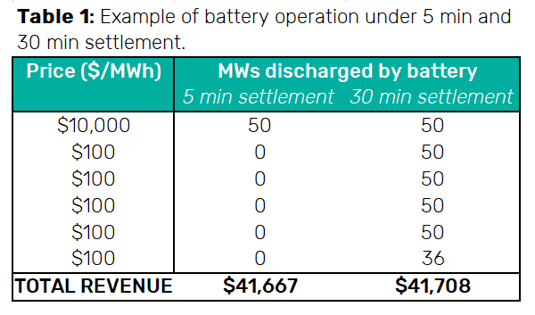
Table 1 shows a theoretical 30 minute period. It contains one price spike of $10,000/MWh while the remaining five minute intervals have a price of $100/MWh. Under five minute settlement, a 50 MW battery could discharge 50 MW during the price spike and stay idle in the remaining intervals to earn $41,667 for the half hour. Conversely, the averaging effect under 30 minute settlement means that the battery would need to be discharging at full power for nearly the whole 30 minutes to capture the same revenue. This means that a much smaller (and cheaper) battery could earn a similar revenue. In other words, each MWh of battery capacity will be able to capture more revenue under the five minute settlement rule change. This significantly changes the economic proposition of battery storage in the NEM.
Demand response will be harder for many industrials
Large energy users have been responding to spot pricing since the commencement of the NEM. Through our own experience, as well as discussions with other industry experts like Paul McArdle of Global Roam, we believe it is likely that there are thousands of megawatts of demand response in the NEM from the large energy user sector.
Interrupting an industrial process, in particular, is inherently more complex than controlling a hot water system or air conditioning. Firstly, most industrials prefer to perform a controlled stop of their process rather than an emergency stop. This is because an emergency stop puts the machinery at a higher risk of damage. Secondly, most industrial processes require a safety check before being interrupted. Because of these reasons, many industrials will struggle to respond in a faster, more volatile five minute market. Industrials will need to think about whether they can make any further improvements with automation and will likely need to revise their curtailment strategies to account for the higher risks involved.
Author: Marija Petkovic, Founder & Managing Director of Energy Synapse
Follow Marija on LinkedIn | Twitter