Carbon emissions intensity of electricity continues to fall
December 4, 2018
Share
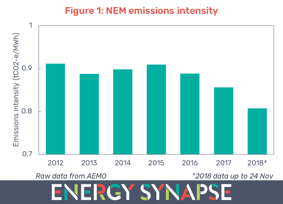
The carbon emissions intensity of the National Electricity Market (NEM) looks set to continue to fall in 2018 for the third year in a row. Figure 1 shows the average emissions intensity for each calendar year from 2012 to present.
Emissions intensity is a measure of how many tonnes of carbon dioxide equivalents (tCO2-e) are emitted for each megawatt hour (MWh) of electricity that is sent out to the grid. The data in Figure 1 has been compiled from publications by the Australian Energy Market Operator.
Note that this data looks at the emissions intensity of the grid. It does not include rooftop solar as it is treated as negative demand rather generation. Note also that from 1 June 2014 onward, AEMO changed the methodology for calculating emissions data from estimated to actual data. We have adjusted the pre-June 2014 data to reflect the change in methodology as per AEMO’s impact assessment.
Figure 1 shows that the emissions intensity of the grid started to increase in 2014 and 2015. This coincides with the repeal of the carbon tax in July 2014 by the Abbott Government. The decreasing trend from 2016 is due to a combination of growing renewable energy and the closure of coal-fired power stations.
Coal closures and renewables growth driving decline of carbon intensity
Figure 2 shows the emissions intensity by state. We can see that the steepest reductions have come from South Australia (43% down from 2012) and Victoria (17% down from 2012). These are also the states which have experienced coal closures.
Firstly, Northern Power Station (520 MW black coal) in Port Augusta, SA, was permanently closed in May 2016. This was the last coal-fired power station in South Australia. Secondly, Hazelwood Power Station (1600 MW brown coal) in Victoria, closed at the end of March 2017. Hazelwood was not only Australia’s dirtiest power station, but also one of the most polluting in the entire OECD.
NSW is in the middle of the pack at number 3, having reduced its emissions intensity by 9% since 2012. Tasmania has always had a very low emissions intensity due to the majority of the state’s generation coming from hydro power. Queensland has gone up slightly.
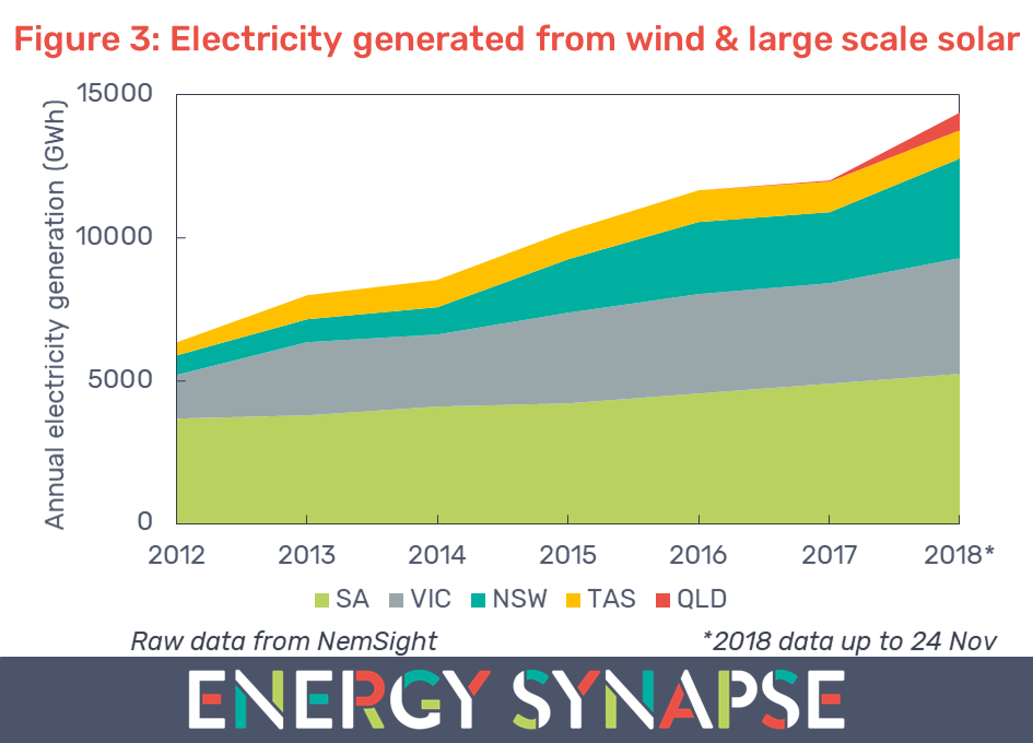
Figure 3 shows the annual electricity that was generated from wind and large scale solar for each state. We have compiled this data using NemSight, a software developed by Creative Analytics (part of the Energy One group).
The generation from large scale wind and solar in the NEM has more than doubled since 2012, from 6350 to 14400 GWh. In terms of percentage of total NEM wide generation, this is an increase from 3.4% to 8.6%.
We can see from Figure 3 that NSW has added the most variable renewable generation from 2012 to now. South Australia is second and Victoria third. In contrast, Queensland has been very late to the large scale renewables party. Though, as noted in our previous article, QLD has recently emerged as the national leader in both small and large scale solar.
Liddell (2000 MW black coal) in NSW will be the next power station to retire in 2022. We can expect to see a significant dip in the emissions intensity of NSW as well as the entire NEM when this happens. However, unlike the owners of Hazelwood, AGL has provided ample notice to enable an orderly transition.
Author: Marija Petkovic, Founder & Managing Director of Energy Synapse
Follow Marija on LinkedIn | Twitter
QLD solar is booming and pushing down daytime electricity prices
October 31, 2018
Share
2018 is already a record year for solar PV in Australia, and in particular, the utility scale sector. Queensland (QLD) leads the nation across several metrics as shown by the latest data from the Australian PV Institute (APVI) released on 25 October 2018:
(i) QLD has the highest total installed capacity (3,536 MW) out of any state;
(ii) QLD has the highest residential rooftop solar penetration by both capacity (1,935 MW) and percentage of dwellings (32.6%); and
(iii) QLD has the highest large scale (100+ kW) solar PV capacity (1,316 MW).
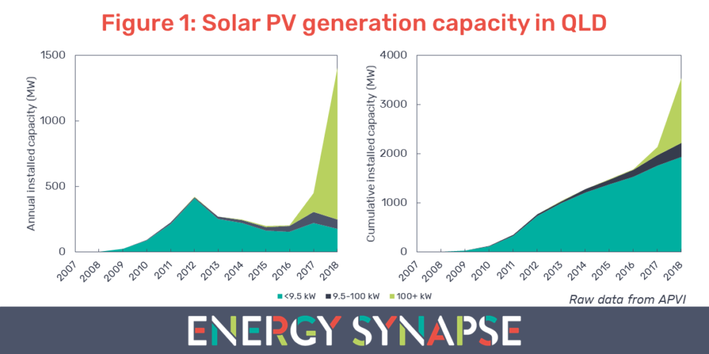
Figure 1 shows the annual and cumulative generation capacity for solar PV in QLD from 2007 to present. The data is segmented by system size: <9.5 kW (residential), 9.5-100 kW (small commercial & industrial), and 100+ kW (large C&I and utility generation).
More solar has been added to the QLD grid in the first 10 months of 2018 than in the previous five years combined. 2018 is also the first year where the deployment of large scale solar (100+ kW) has exceeded small scale solar. 88% of the large scale solar generation capacity in QLD comes from solar farms 50+ MW in size. This extraordinary growth in utility scale systems has come about from a combination of drastic decreases in the cost of solar as well as government funding opportunities (particularly from ARENA).
The commercial and industrial sector is also seeing strong growth. Cost decreases in solar combined with high electricity prices brought on by the energy crisis over the past two years, means that for the first time ever, solar is a cost competitive option compared with traditional electricity contracts for large C&I energy users. In contrast, residential installations peaked in 2012, coinciding with the end of generous feed-in-tariffs and multipliers for small-scale technology certificates (STCs).
Growth in QLD solar is depressing daytime electricity prices
Most in the energy industry are familiar with the duck curve – the hollowing out of daytime electricity demand by solar PV. But solar does not just affect electricity demand. The zero marginal cost of solar means that it is also very good at pushing down daytime electricity prices in the wholesale market.
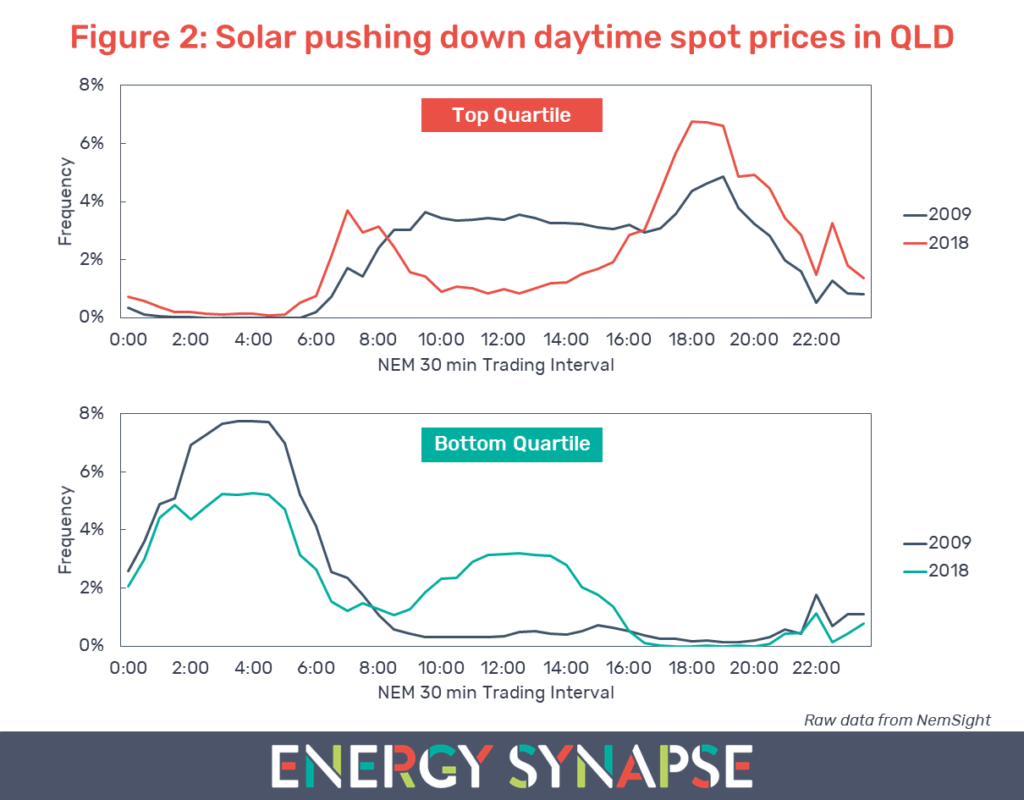
Figure 2 shows how the growth in QLD solar has altered price patterns in the wholesale energy market. The top part of Figure 2 shows the top quartile of spot prices (i.e. top 25% of pricing) in 2009 and 2018. In contrast, the bottom part of Figure 2 shows the bottom quartile (bottom 25% of pricing). We have compiled this data using NemSight, a software developed by Creative Analytics (part of the Energy One group).
Note that Figure 2 shows us how electricity prices in the top and bottom quartile are distributed across each 30 minute Trading Interval. It does not show the value of prices.
We can see that in 2009, the top quartile of pricing was distributed fairly uniformly across daytime trading intervals with a small peak in the evening. The top 25% of prices occurred between 9:00 and 15:30 46% of the time. In contrast, this was only 17% of the time in 2018. High pricing is now occurring more often in the early morning and evening when solar panels are generating little or no power.
Furthermore, these daytime intervals are not only leaving the top quartile of pricing, but are actually entering the bottom quartile. In 2009, the bottom 25% of pricing occurred during 9:00 to 15:30 only 6% of the time. This has increased to 34% in 2018.
The video below shows the full evolution of QLD wholesale electricity prices for the top quartile over the last decade.
Diminishing returns for QLD solar
The big implication of the duck curve in electricity pricing is that those investing in solar may experience diminishing returns. More solar means lower and lower daytime electricity prices. Thus, we may reach a point where electricity prices are so low during the day, that further investment in solar can no longer be justified.
There is a solution to this problem of course, and that is energy storage. Combining solar with storage allows energy to be shifted to more valuable times of the day, thereby increasing revenue for investors. For anyone building QLD solar projects, the question is not if you should add storage, but when.
Want to know how solar and wind farms are performing in the NEM and what revenues they are receiving? Get a copy of our detailed analysis.
Author: Marija Petkovic, Founder & Managing Director of Energy Synapse
Follow Marija on LinkedIn | Twitter